)
Dashboard Software and Tools in 2026: BI, Embedded Analytics & Workspace Comparison

TL;DR
Dashboards are the output layer. The real challenge is the analysis behind them — how metrics are defined, built, and maintained over time. This guide breaks down dashboard software in 2026 into three layers: BI platforms, analytical workspaces, and lightweight or embedded tools. It focuses on how teams actually use these tools together, and whether dashboard numbers can be traced back to reliable, reproducible analysis.
What you will learn
The best dashboard software and tools in 2026
How traditional BI tools, embedded analytics, and analytical workspaces differ
Which dashboard tools fit which team type
How to evaluate dashboard software without locking into one vendor
Where the analysis behind the dashboard actually happens
How to evaluate dashboard software
The dashboard market has been mature for over a decade, which means most tools demo well. The differences show up later — when a metric changes definition, when the source data shifts, or when someone asks where a number came from.
Does it connect to your actual data sources, or only the warehouses on the vendor's slide?
Can metric definitions be shared across dashboards so the same number doesn't conflict?
Is the AI feature useful, or is it a natural-language wrapper around the same old query builder?
Can a non-author of a dashboard understand what the numbers mean a quarter later?
How does the tool handle the analytical work upstream of the dashboard?
Does the pricing scale with your team, or punish you for adopting it widely?
Enterprise BI Platforms
These are the core enterprise platforms most large organizations already rely on. The AI features added in 2024–2026 improve usability, but they still sit on top of established dashboard infrastructure rather than fundamentally changing it.
Power BI: Microsoft's Default for Enterprise Dashboards
Power BI is the default for organizations on Microsoft 365 and Azure, and the integration is so tight that most teams don't really evaluate alternatives. Copilot in Power BI now handles natural language queries, generates DAX expressions, and writes summaries against your data model.
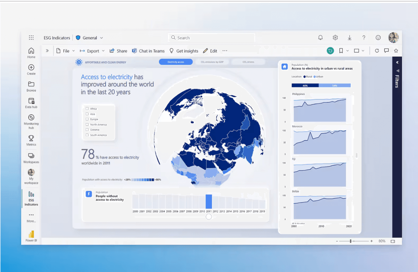
Native to Microsoft 365 and Azure environments
Copilot for Power BI handles natural language and DAX generation
Anomaly detection, forecasting, and Q&A built into the platform
Strongest choice for teams already inside the Microsoft stack
Tableau: The Visualization Standard
Tableau still has the best visualization engine on the market, and the 2024 shift from Ask Data to Tableau Agent and Tableau Pulse moved the AI from a standalone feature into the actual workflow. Pulse delivers metric alerts into Slack and email; Agent handles conversational queries inside the workspace.
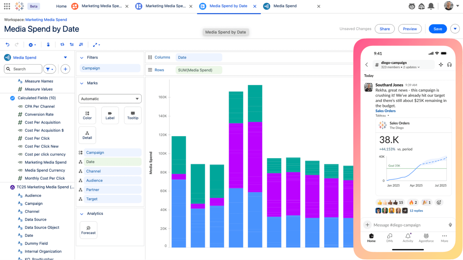
Best-in-class visualization quality
Tableau Agent and Pulse embed AI into normal dashboard use
Large ecosystem of community workbooks and templates
Strong fit for teams that prioritize visual quality over engineering integration
Looker: BI for Governed, Shared Metrics
Looker’s pitch is governance. Define a metric once in LookML and every dashboard in the organization queries from the same definition. That consistency becomes critical at scale — avoiding situations where core metrics like revenue or retention differ between sales and finance dashboards, which otherwise leads to repeated reconciliation work.
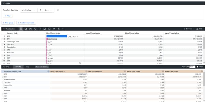
LookML keeps metric definitions consistent across the organization
Strong fit for teams that have outgrown ad-hoc, decentralized reporting
Deep integration with Google Cloud and BigQuery
Higher technical bar than Power BI or Tableau for initial setup
Modern Analytics Platforms
This category overlaps with dashboards but isn't really about them. These are the tools where the actual analysis happens — the work that the dashboard tools then visualize. Most data teams in 2026 use both.
Zerve: Analytical Workspace Behind the Dashboard
Most dashboard problems aren't dashboard problems. There are problems with the analysis upstream — the metric that was defined two analysts ago, the pipeline that nobody quite remembers, the assumption that nobody documented. Zerve sits at that layer: a DAG-based notebook environment where the analysis behind the dashboard lives, with institutional knowledge captured alongside the code.
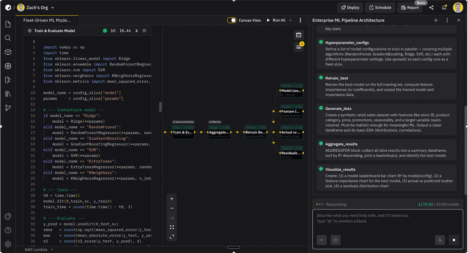
Conversational reports take it a step further — the same analytical work can be turned into an interactive report that stakeholders can query directly, without rebuilding the analysis in a separate BI tool. The result is fewer broken handoffs between the analyst who built the work and the dashboard that surfaces it.
DAG-based notebooks for the analytical work behind the dashboard
Conversational reports stakeholders can query without an analyst
Institutional knowledge layer captures the why, not just the code
Python and R in the same environment, on the same data
Hex: Notebooks That Become Dashboards
Hex sits between a notebook and a BI tool. Analysts write SQL and Python in a familiar notebook environment, then publish the same work as an interactive app for stakeholders. The collaboration model is its real differentiator — multiple people can edit the same notebook in real time, which most notebook environments still can't do well.
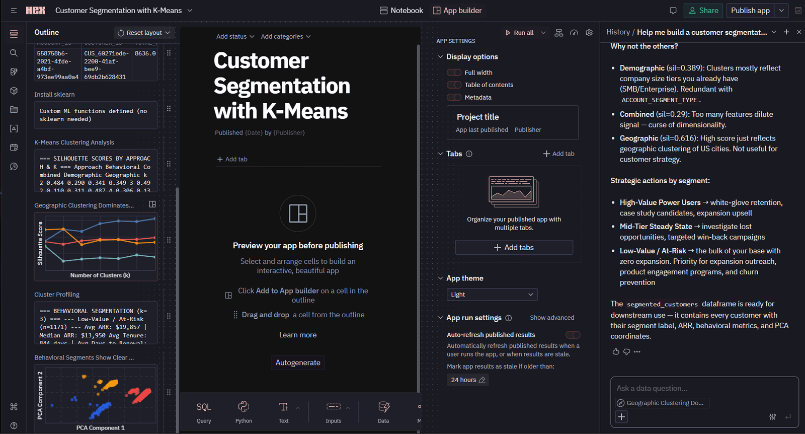
Notebooks and dashboards in the same environment
Strong real-time collaboration model
Magic AI features for SQL generation and chart creation
Good fit for teams that want one tool from analysis to share
Mode: SQL-First Analytics with a Dashboard Layer
Mode is the canonical "SQL plus Python in a notebook plus a dashboard" tool, and the ThoughtSpot acquisition has added a more aggressive AI layer for natural language queries on top. Strongest fit is analyst teams that want SQL to be the source of truth and dashboards to follow from it.
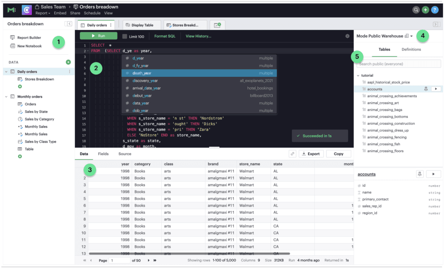
SQL-first workflow with Python for deeper analysis
Dashboards built directly from notebook outputs
Natural language layer through ThoughtSpot integration
Strong for analyst-led teams who don't want to rebuild in a separate BI tool
Lightweight and Embedded Dashboards
Not every dashboard needs to be enterprise-grade. The tools in this category fit teams that need a dashboard fast, or product teams that want to embed analytics into their own application.
Metabase: Open-Source Self-Serve BI
Metabase remains the most popular open-source BI tool, and the hosted version added AI-assisted question building in 2025. The pitch is the same as it's always been: a non-technical user can ask a question of the data without needing an analyst to build a dashboard.
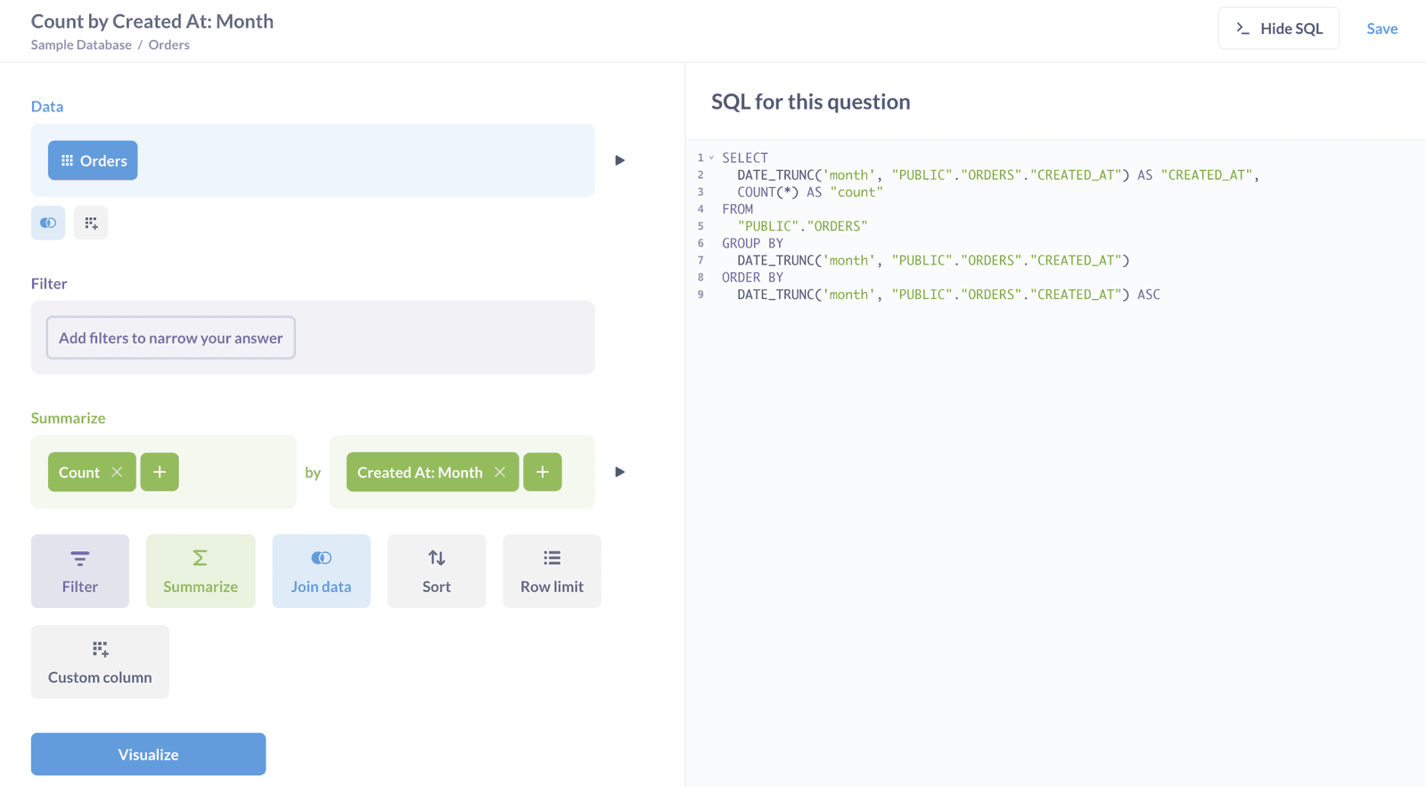
Open-source with a hosted commercial version
Strong self-serve layer for non-technical users
Native question-asking interface for ad-hoc data exploration
Good fit for smaller teams and product-led analytics
Sigma: Spreadsheet UI on a Cloud Warehouse
Sigma's hook is that it looks like a spreadsheet, but queries live against a cloud warehouse. For organizations where most analysis still happens in Excel or Sheets, Sigma's familiarity is the selling point. The AI layer added handles for formula generation and natural language exploration.
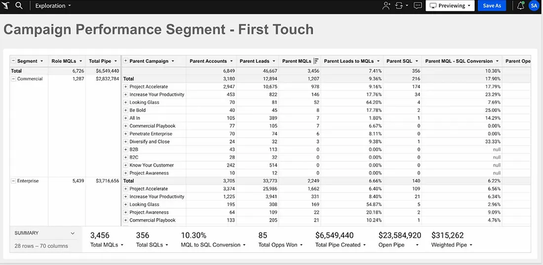
Spreadsheet UI over Snowflake, BigQuery, Databricks
Familiar to anyone coming from Excel or Sheets
AI formula generation and natural language layer
Strong fit for finance, ops, and business teams used to spreadsheets
Retool: Dashboards as Internal Apps
Retool is positioned as a low-code internal tool builder, but a large chunk of usage is dashboards. The difference from a pure BI tool is that Retool dashboards can also write back to systems — trigger a workflow, update a record, send a notification. For internal ops teams, that turns a dashboard from a viewing surface into a working tool.
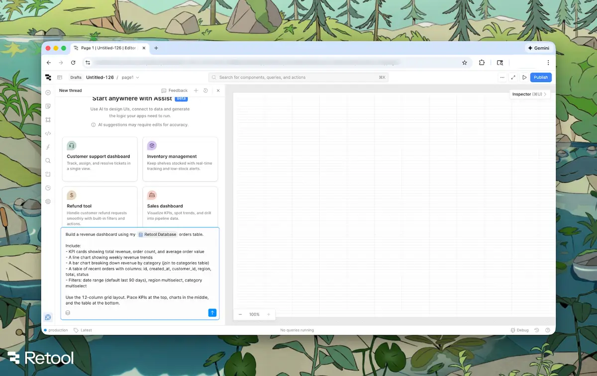
Dashboards that can read and write to systems
Strong fit for internal ops, support, and engineering tools
Component-based builder with AI-assisted layout
Less suited to executive reporting, more for operational dashboards
Dashboard software comparison
How dashboard stacks actually look in practice
Most teams don’t rely on a single dashboard tool. They use a stack:
A BI platform for executive reporting and standardized dashboards
An analytical workspace where metrics are defined and validated
A lightweight or embedded tool for ad-hoc questions and product-facing analytics
Problems usually appear when one tool is forced to cover all three layers instead of being used for its intended role. For a deeper breakdown of how these layers fit together, see our data analytics platform evaluation guide.
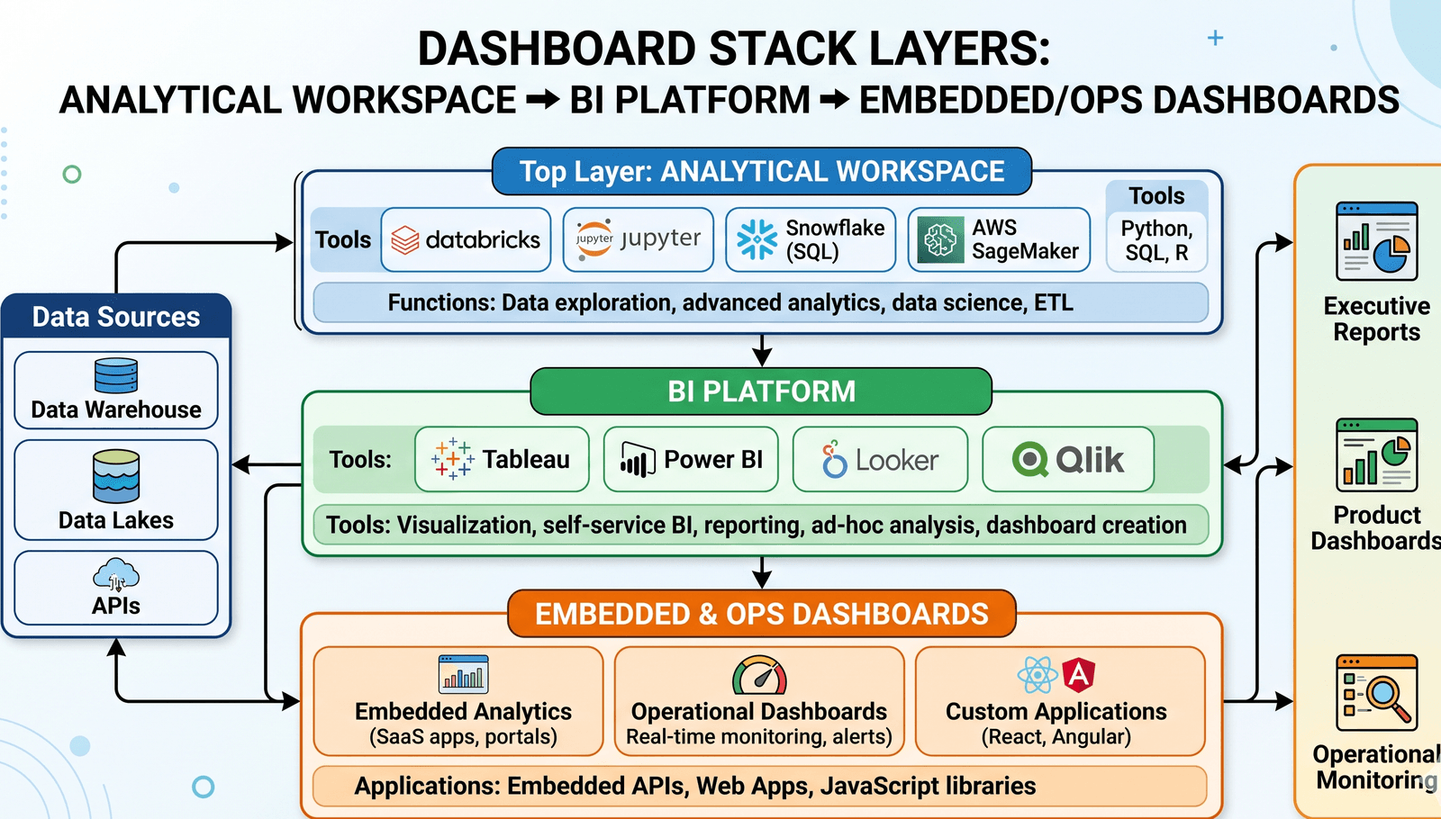
Which dashboard tools fit each role
How to choose the right dashboard software
Start from where your current stack actually breaks. If executives can't get answers in the format they want, the BI layer needs work. If the same metric is defined three different ways across three different dashboards, that's a metrics-layer problem. If nobody can defend the analysis behind a dashboard six months later, that's an analytical workspace problem — and it's the one most teams underestimate.
If your dashboards keep breaking because the analysis behind them never quite holds up, Zerve is built for that exact problem. The free tier takes minutes to set up.
Start with Zerve and see how the work behind your dashboards holds up.
Frequently Asked Questions
There isn't one best dashboard tool — the right answer depends on whether your priority is enterprise reporting (Power BI, Tableau, Looker), analyst-led work (Hex, Mode, Zerve), or lightweight self-serve (Metabase, Sigma). Most strong stacks use two or three together.
In practice they overlap. "BI tool" usually implies a heavier platform with governance and a semantic layer (Power BI, Tableau, Looker). "Dashboard software" is broader and includes lighter tools (Metabase, Retool) and notebook-based platforms (Hex, Zerve, Mode).
Yes. Power BI, Tableau, Metabase, and Sigma are all designed to be usable without code. The trade-off is that the analysis behind the dashboard often still requires technical work, which is where platforms like Zerve fit in.
Most AI features in dashboard tools fall into three categories: natural language queries (ask a question, get a chart), generation (write SQL, DAX, or a formula), and summarization (turn a dashboard into a written narrative). The quality varies widely — the better ones are tied to a well-defined semantic layer, the weaker ones are wrappers around general-purpose models.
Connectivity to your real data sources, governance of metric definitions, how the AI features actually behave on your data (not the demo dataset), pricing as your team scales, and how well the tool handles the analytical work upstream of the dashboard itself.